
Decoding the Ivory Tower: Examining the Relationship Between Wealth and Elite Education
Elite education has been long seen as a ladder to opportunity—but who gets to climb it? This article investigates how family income shapes access to the nation’s most prestigious universities.
Introduction
Throughout this article, we’ll examine the relationship between income brackets and the proportion of students that make up Ivy Plus schools, which we define as Brown University, Columbia University, Cornell University, Dartmouth University, Duke University, Harvard University, Massachusetts Institute of Technology, Stanford University, Princeton University, University of Chicago, University of Pennsylvania, and Yale University.
Data
The data was collected from a research paper written by Professors Raj Chetty, David J. Deming, and John N. Friedman. The paper analyzes college admissions from 2011-2015 and uses income data from 2015 with income percentiles specified below. Click here for the GitHub repository with all the data and code.
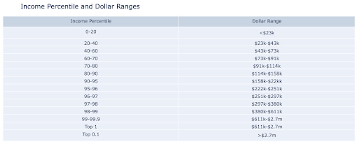 Figure 1: Dollar ranges of income brackets
How Does Income Measure Up with Every School?
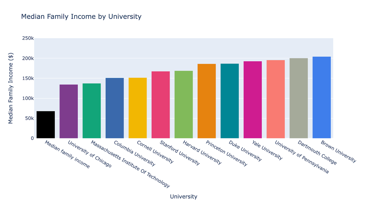 Figure 2: Family income by university
The 2015 median family income in the United States was $57,800. Figure 2 shows the median family income at each Ivy Plus school. For all these colleges, it is above $130k, nearly twice as much as the country’s average. Harvard is relatively average among these schools, with a median income of 150k. To put this into perspective, Harvard grants full aid to families with an income of 85k—24% of the student body. If students were representative of the United States population, then over two-thirds of families at Harvard would qualify for full financial aid.
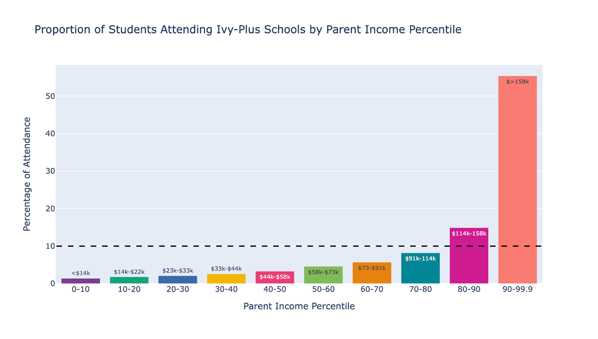 Figure 3: Ivy Plus attendance rates by income bracket
Across elite schools, there is a large disparity between wealth distribution in their student populations. The richest 10% income bracket makes up 55% of the student body at Ivy Plus schools, which is 40 times higher representation than the lowest income bracket. Interestingly, if these schools were representative of all students, then the two populations would be equal.
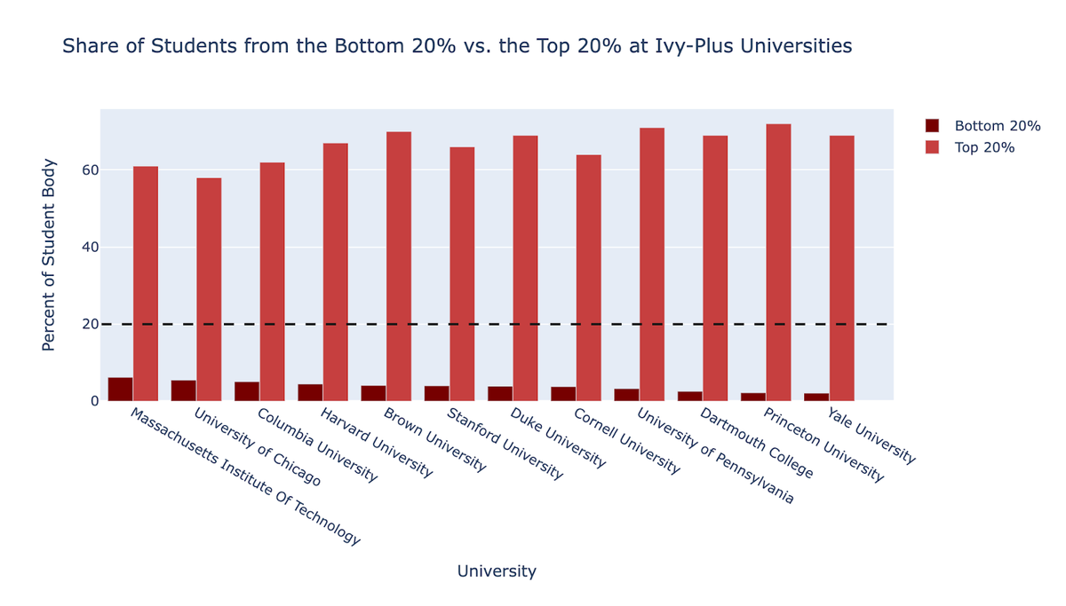 Figure 4: Share of students from the bottom 20% and top 20%
Figure 4 puts into perspective the differences in proportion between students that fall in the lowest and highest 20% income brackets at each of the universities. While MIT has the highest proportion of the lowest income bracket (6.2%) it’s quite lower from a proportionate percentage of 20% and 10 times lower than the proportion of students in the highest income bracket. Yale has the sharpest difference, with the ratio of students hailing from the highest income bracket outnumbering those in the lowest income bracket 33 to 1.
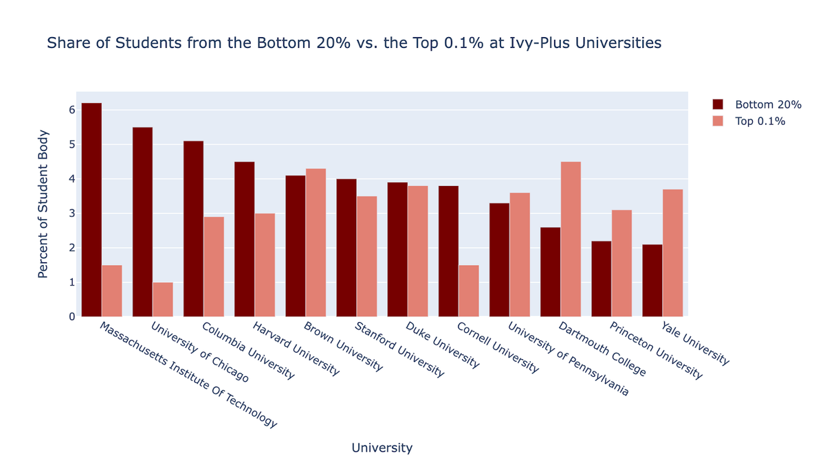 Figure 5: Share of students from the bottom 20% and top 0.1%
Figure 5 depicts the difference in student representation between the lowest 20% and the highest 0.1% of incomes. If the schools represented all students across the country, there would be 200 times more students in the lowest 20% of incomes than those in the highest 0.1%. Note that those in the top 0.1% income bracket have a parent income of over 2.7 million dollars a year. In reality, the proportion of students in the highest 0.1% bracket is almost double that of the lowest 20%.
Adjusting for Test Scores
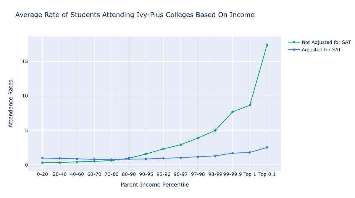 Figure 6: Adjusting for SAT test score
It could be argued that these proportions are affected by academic performance. Figure 4 demonstrates that the top 0.1% of students are 17 times more likely to attend an Ivy League school than their peers. When adjusting for SAT scores—that is, only comparing students who had the same score—the advantage is still clear. Students in the top 0.1% are 2.5 times more likely to attend an Ivy Plus college compared to students with the same test score. Importantly, Figures 6-11 are adjusted for SAT scores.
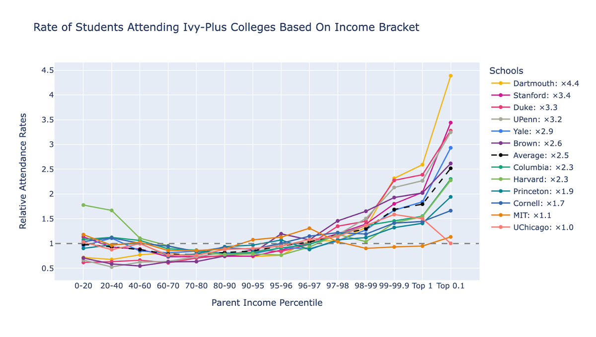 Figure 7: Student attendance rates per school
When we break apart the data into different schools, we get a bigger picture. Though none of these schools are representative of the United States student population, some have starker disparities than others.
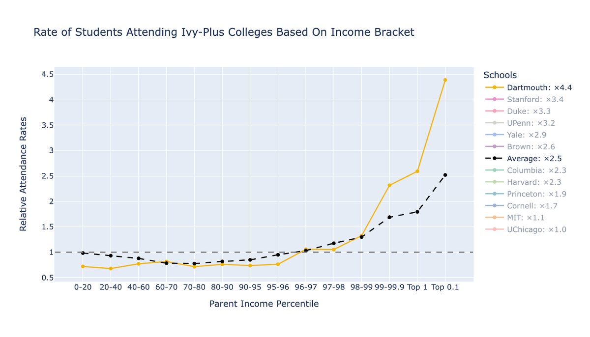 Figure 8: Dartmouth attendance rates
At Dartmouth, students who are in the top 0.1% are 4.4 times more likely to attend the school than their peers with the same test score.
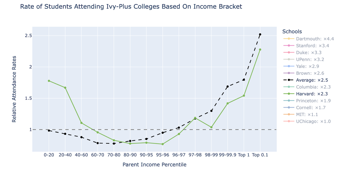 Figure 9: Harvard attendance rates
At Harvard, those in the lowest income bracket (below the 20th percentile) are 1.7 times more likely to attend the school than their peers with the same test scores. Note that the test score advantage, as depicted in Figure 4, essentially reverses the higher rate of attendance for the lowest income bracket. Without test scores being adjusted, this same income bracket is 3 times less likely to attend Harvard than their peers.
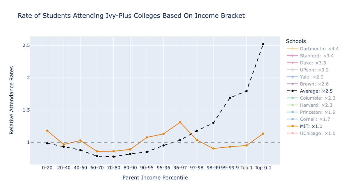 Figure 10: MIT attendance rates
MIT is the school that is closest to being representative of all students in the United States, where those from every income bracket attend the university at almost the same rate.
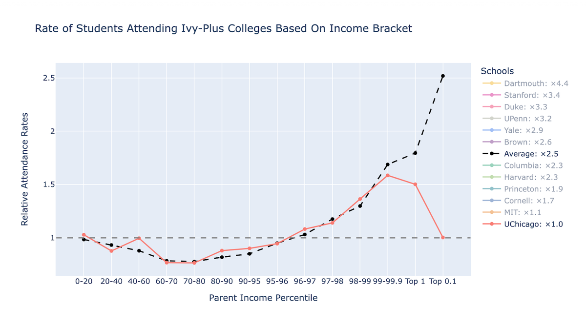 Figure 11: UChicago attendance rates
Finally, at the University of Chicago, the top 0.1% has an equal likelihood of attending the school as their peers in the bottom 20% with the same test scores.